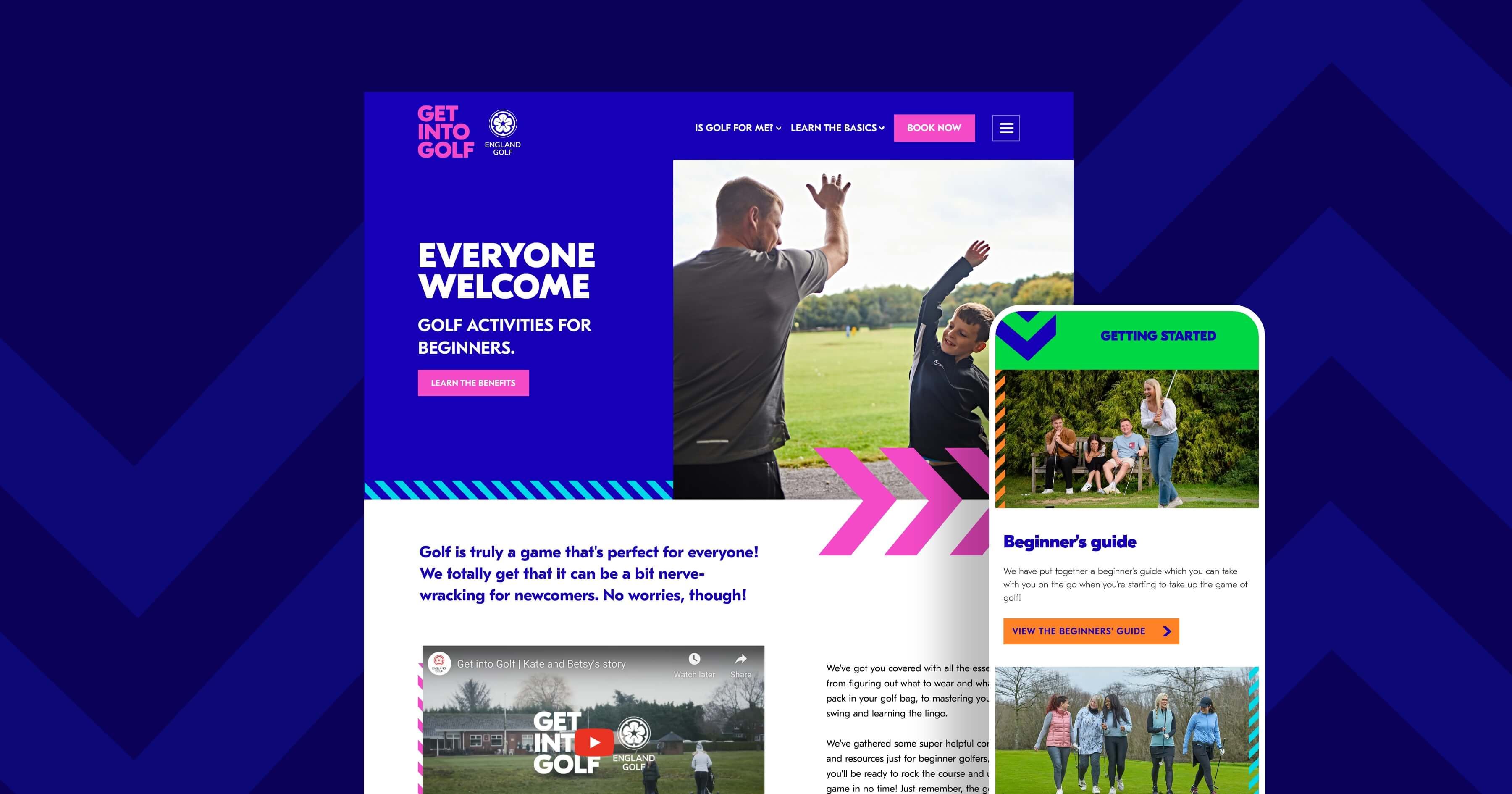
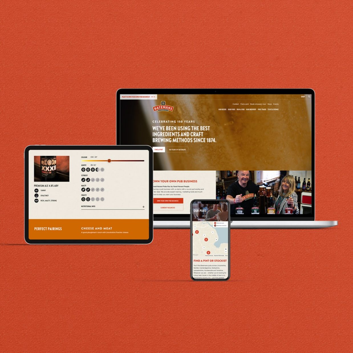
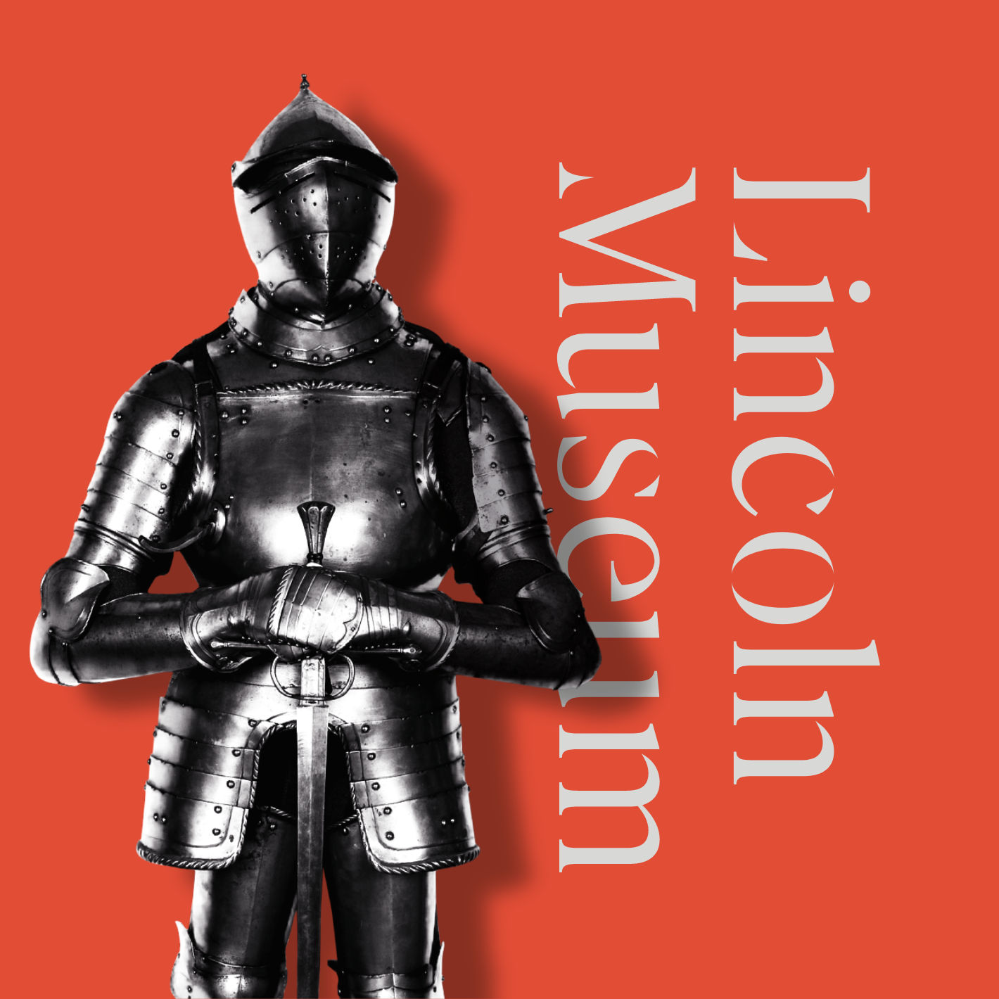
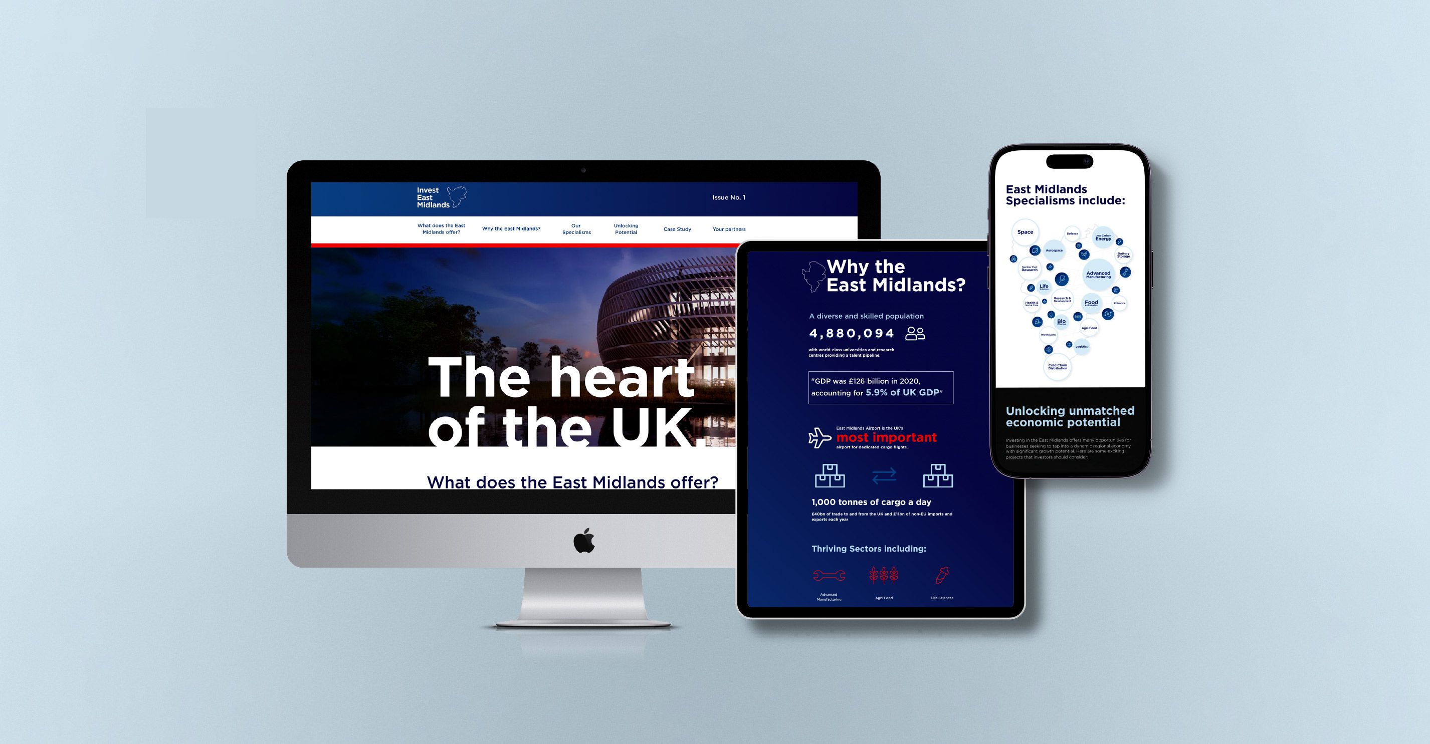
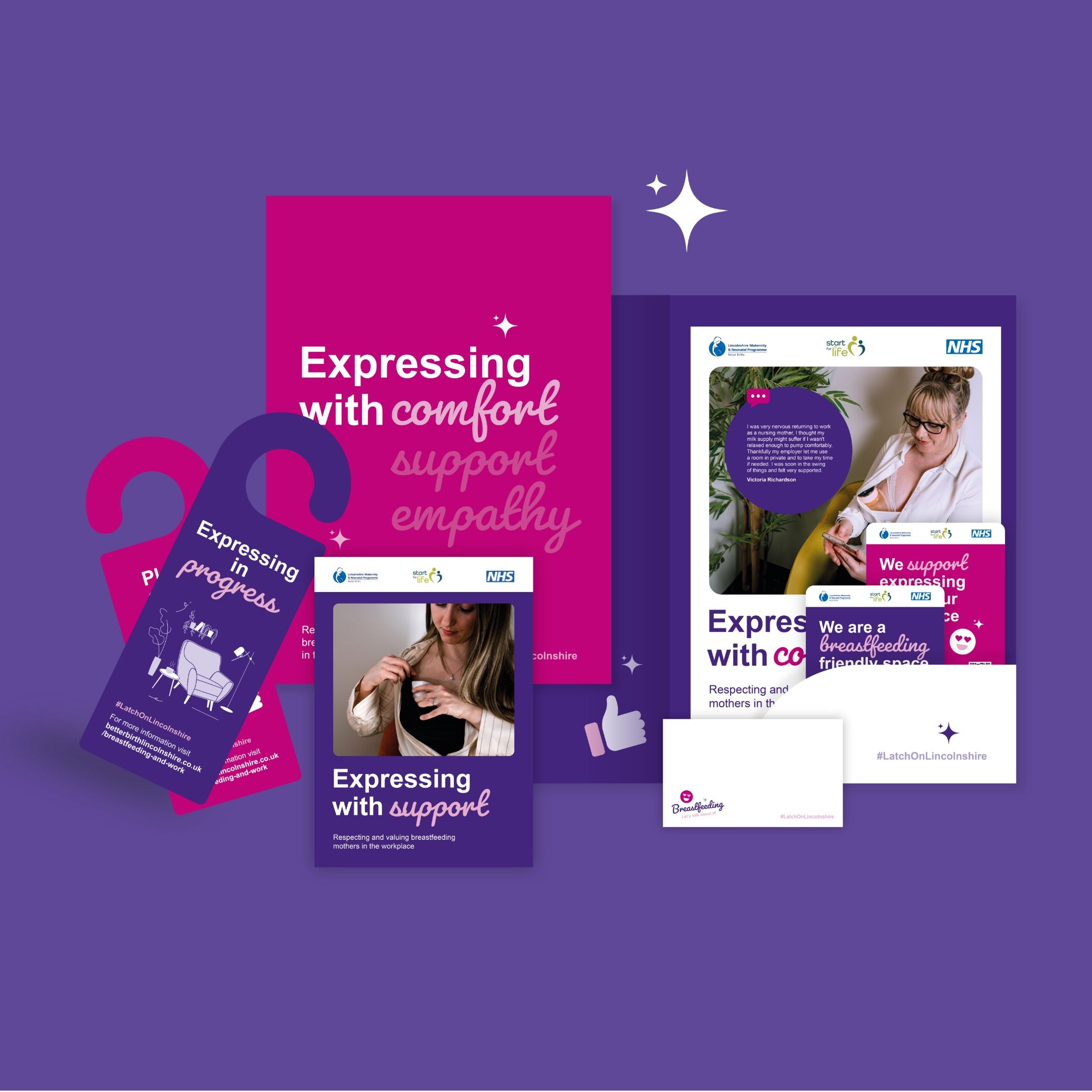
As part of the new brand, a new colour palette was devised which took the primary colours used within the Lincolnshire flag and knocked them back to be more pastel and opaque. Whilst this has a muting effect, it does allow them to be widely used as background tints without being overpowering and distracting. Additional complimentary shades were also developed within the same spectrum to allow wide use across a range of media.
Once the logo, colour palette and fonts had been finalised, supporting graphic devices were then created to enhance, expand and project the brand onto printed and digital materials, usually in the form of backgrounds, headers and footers on documents and web pages. The graphic devices were hand illustrated and took the elements within the logo and elaborated on them - rolling countryside, cattle, tractors and produce were all drawn.