Amberley Labels Pushing the boundaries of premium label design
Turning advanced print technology into distinctive, desirable packaging concepts.
Combining original brand creation with specialist print knowledge, we developed a collection of premium packaging concepts to showcase Amberley Labels’ finishing capabilities. From the product name and story to the bottle, substrate and smallest decorative detail, every element was considered to demonstrate what ambitious label design can achieve.
What we did
Concept development
Packaging design
Label design
The brief
Amberley Labels manufactures premium labels for some of the world’s leading brands. Investing in advanced finishing equipment from A B Graphic International opened up new creative possibilities, and Amberley wanted to show customers what they could now achieve.
Our brief was to create showpiece labels that explored the potential of this technology across key customer markets, including wine, spirits, beer, fragrance, skincare and supplements.
Each concept needed to feel like a real product with a credible identity, a clear audience and a distinctive presence on shelf. The challenge was to bring together sophisticated finishes in a way that felt authentic and desirable. Every embellishment needed a reason to be there.
Possibilities
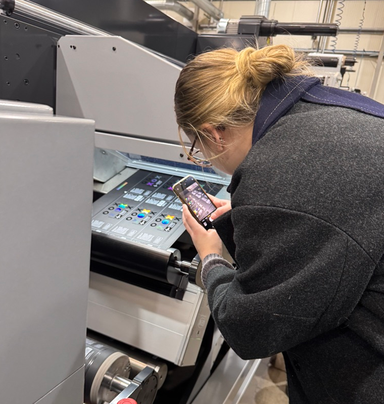
To make the most of the technology, we first needed to understand it. Our team visited A B Graphic International’s manufacturing facility in Bridlington to meet its engineers, see the machinery in action and explore its capabilities first-hand.
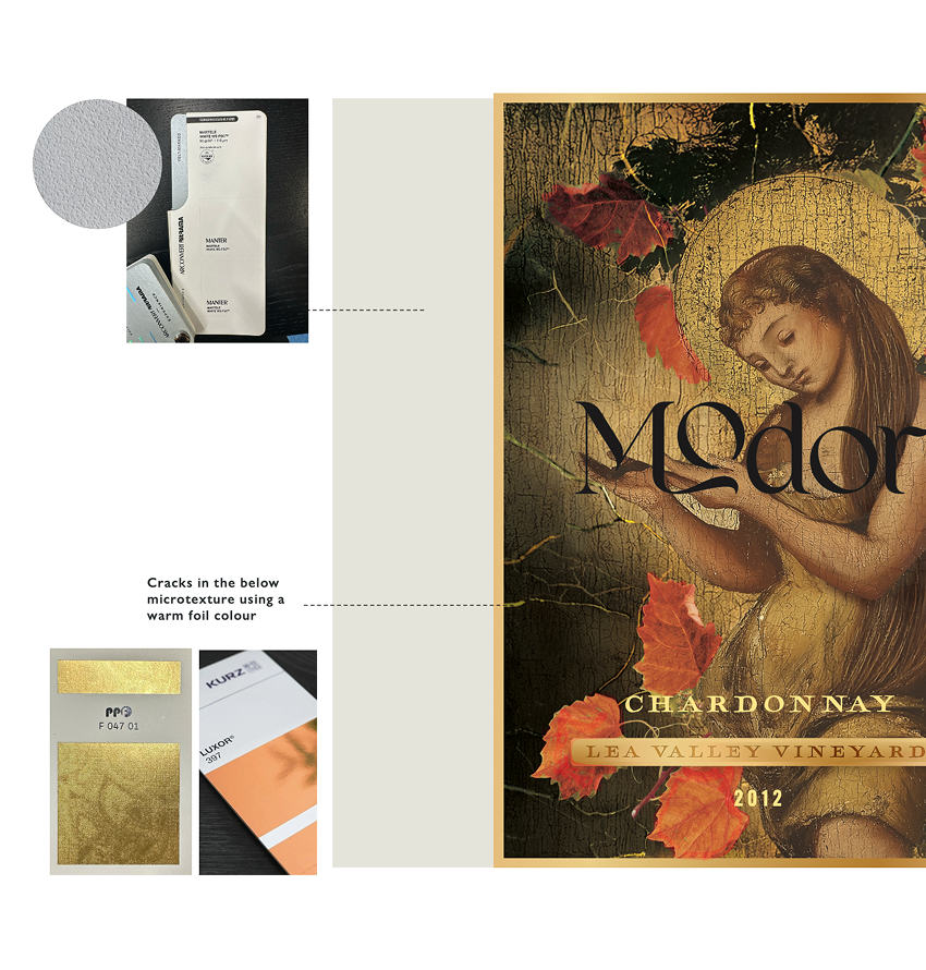
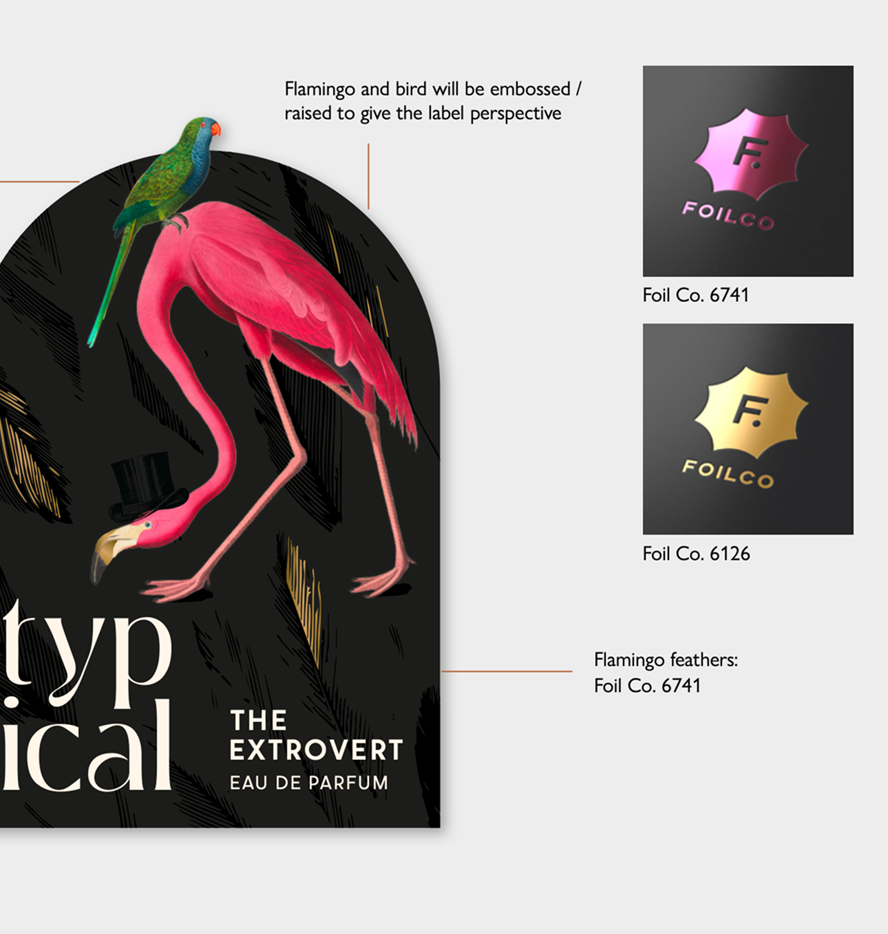
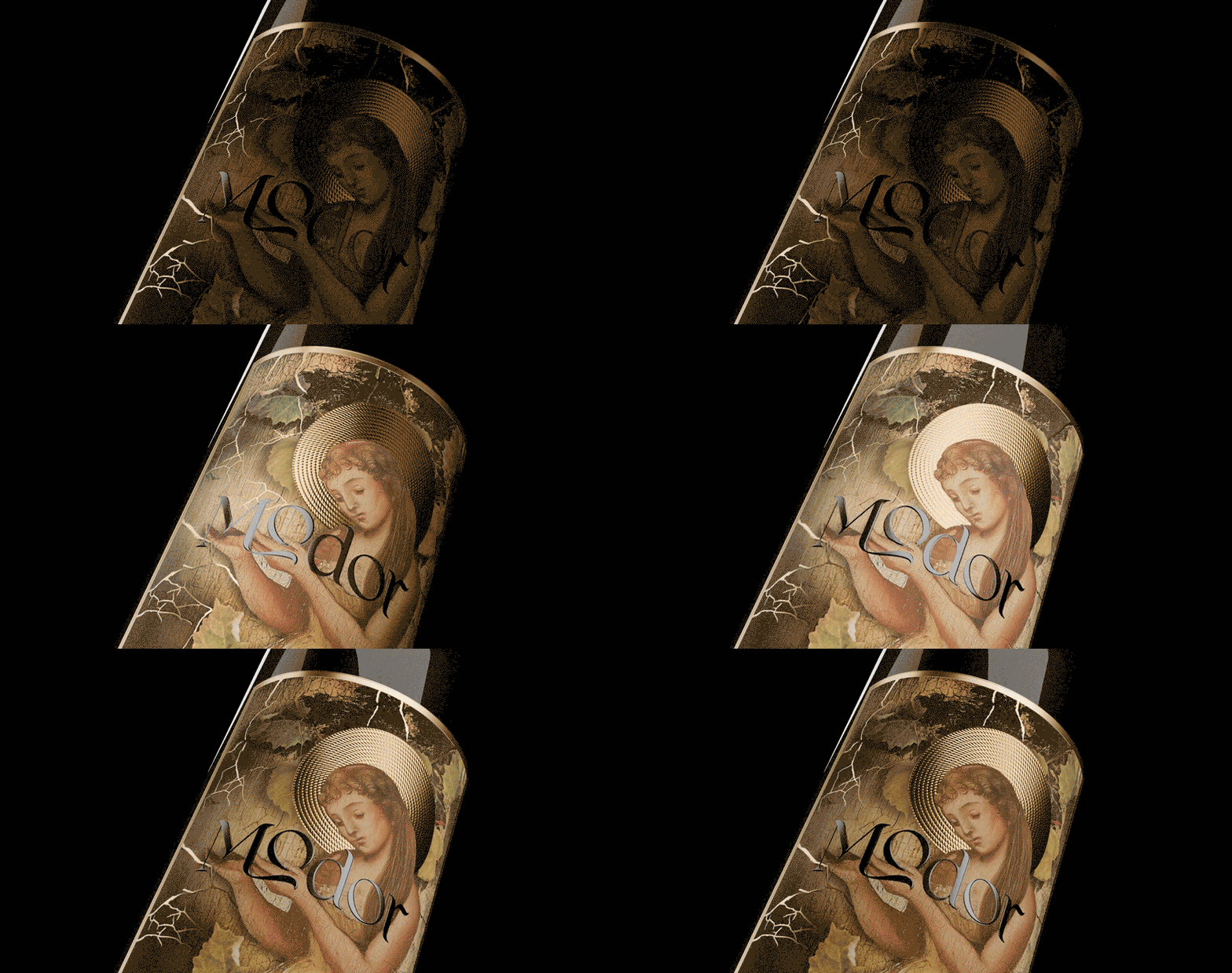
We experimented with foiling, embossing, laminates, die-cutting, layering, microtextures, spot UV and specialist substrates, alongside holographic, neon and reactive inks.
Understanding the process let us push creative boundaries to explore how colour, light, depth, and texture could express a product’s character.
Getting to know the market
Alongside the technical exploration, we researched the categories these products would sit within, from supermarkets and wine merchants to fragrance retailers.
We studied packaging, label design and material guidance to understand category conventions and where we could challenge them.
Creating brands with a story
For each concept, we built the story behind a real product launch, defining the audience, name, personality and points of difference. This gave each brand a clear foundation, shaping everything from typography and colour to illustration and materials.
Finishes became part of the design too, using texture, foil and contrasting surfaces to add depth, highlight details and strengthen the brand story.
A complete product
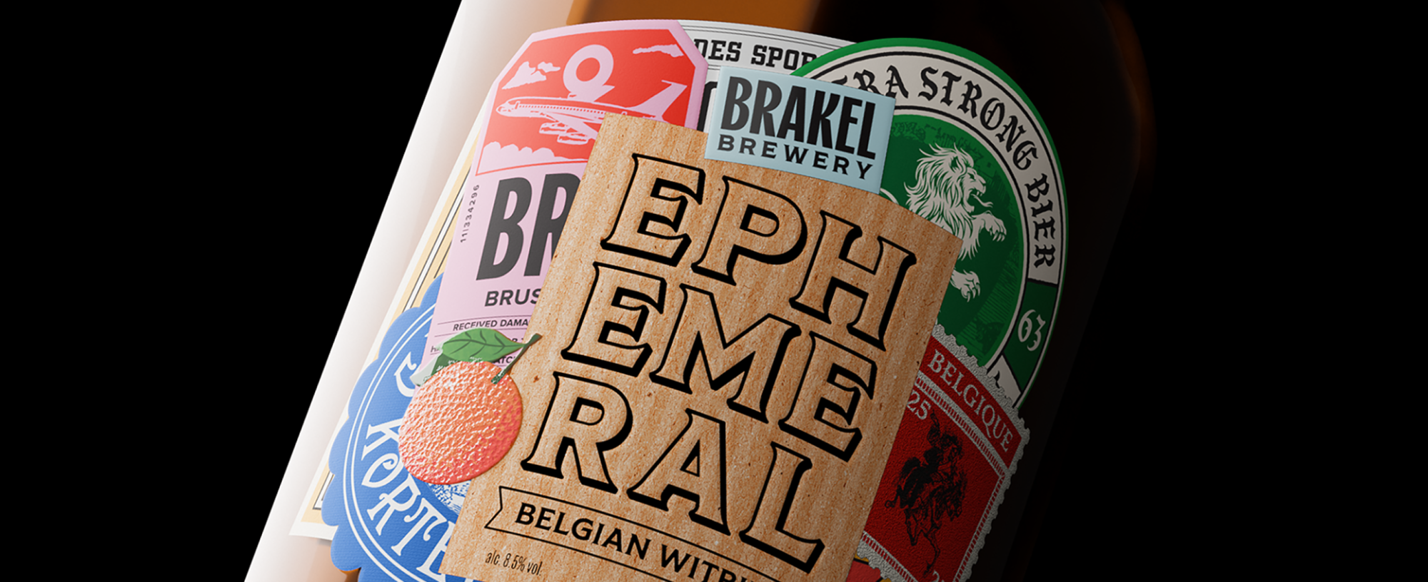
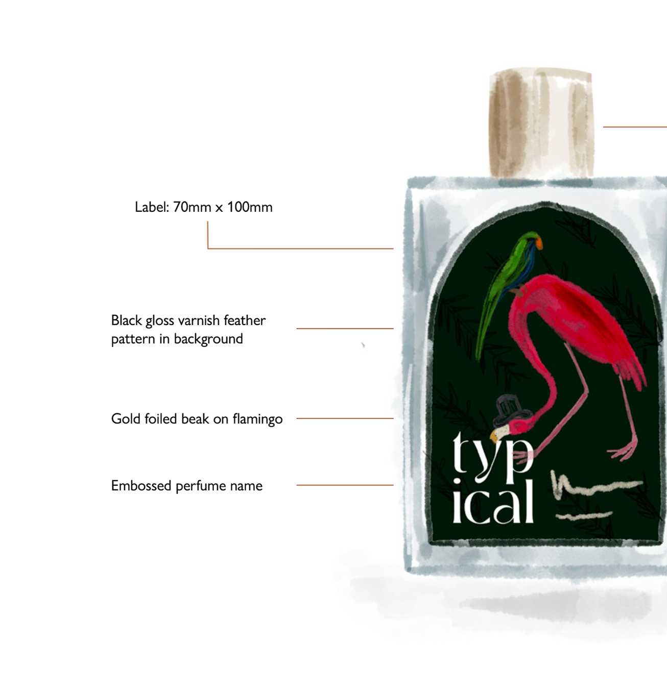
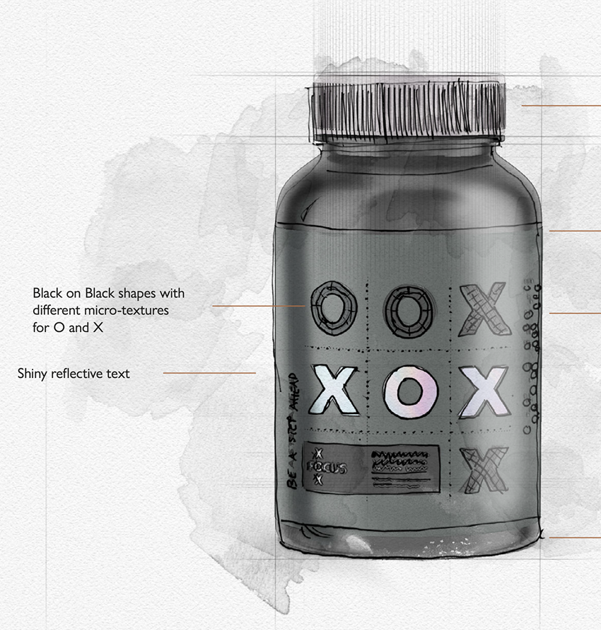
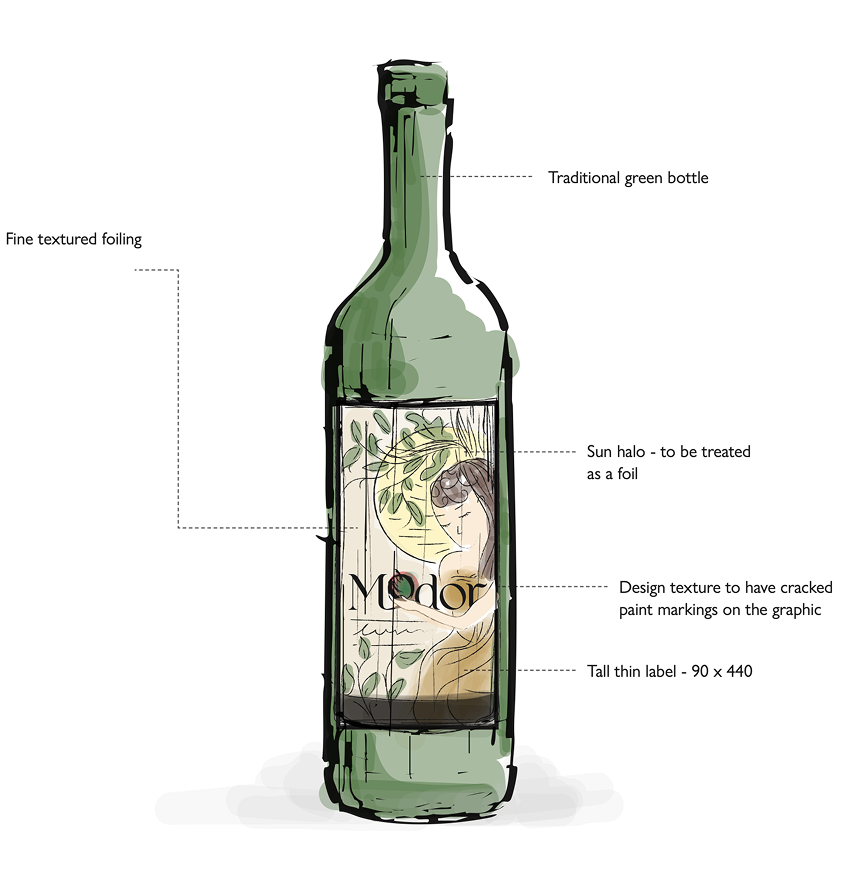
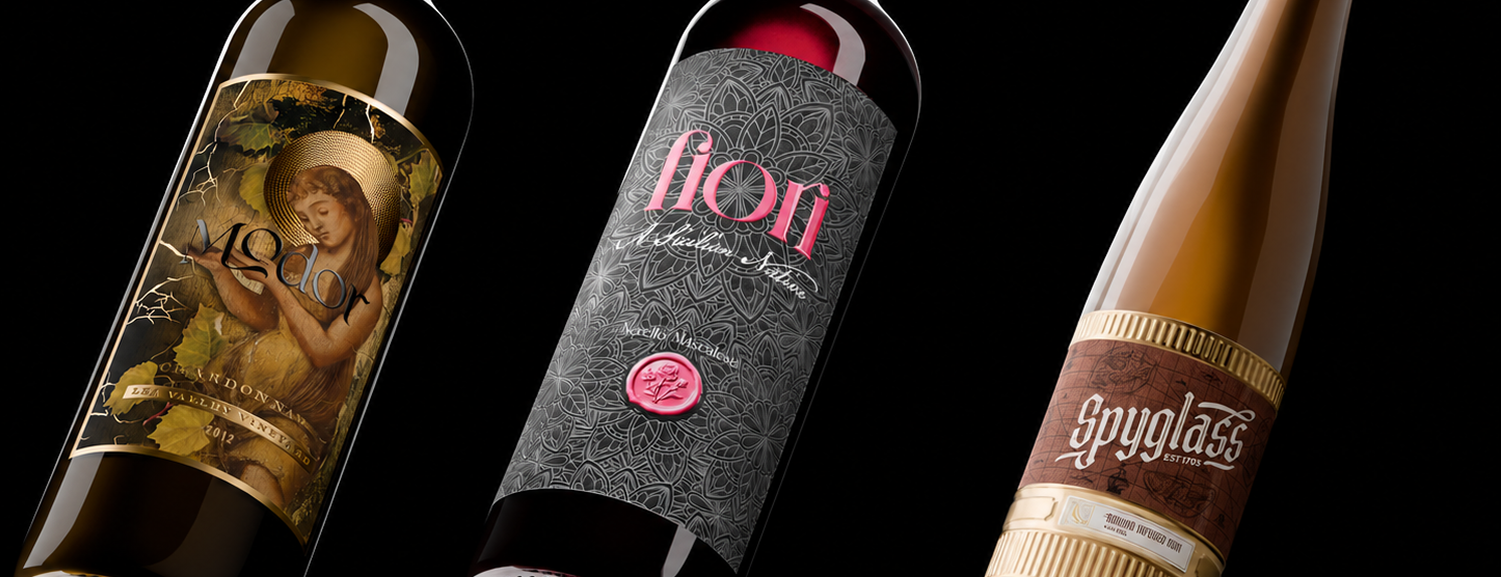
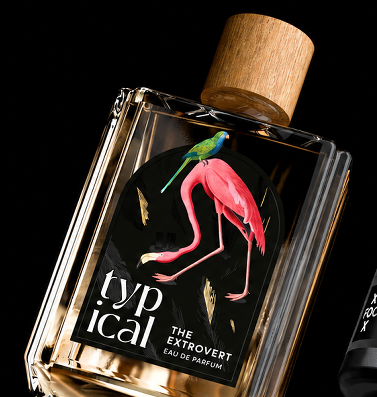
Each concept took its own direction: travel-inspired Brackel beer, nautical Spyglass rum, botanical Typical fragrance, floral Fiori and medieval-inspired Modor wines. XOX supplements explored black-on-black textures and holographic details, while Rayé skincare used warm gradients, sun-inspired graphics and raised finishes.
The packaging was integral to each design. We sourced and tested bottles to find the right shape, colour and material, ensuring the packaging and label worked as one. Finished labels were then applied to the chosen packaging, bringing the concepts and print techniques to life as complete products.
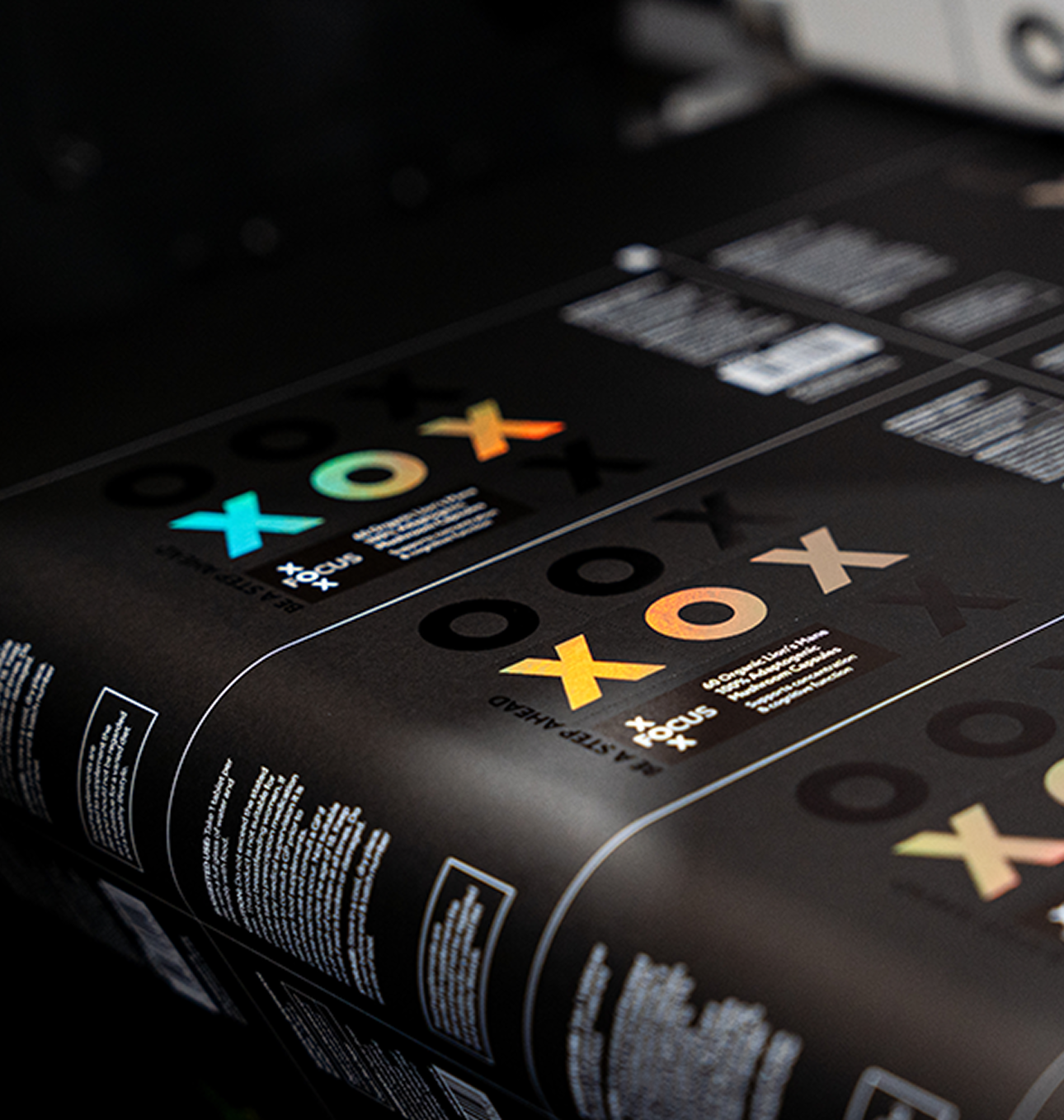
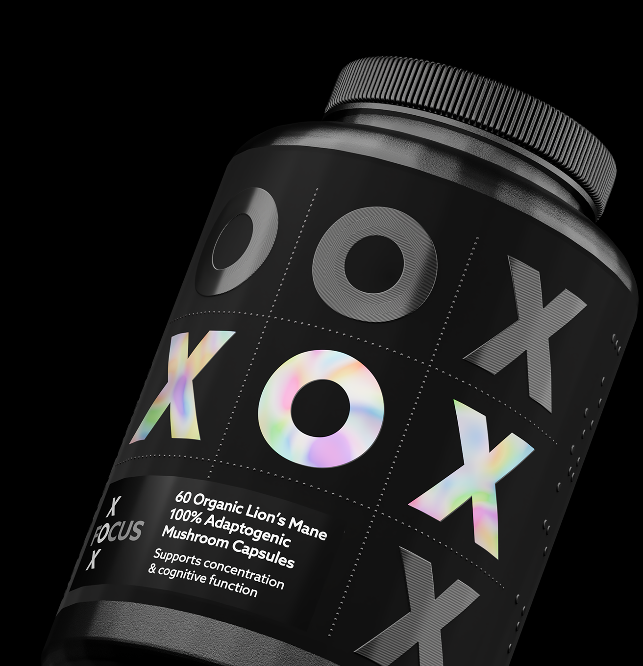
These finished products gave Amberley a tangible sales tool to showcase at trade shows and share through its sales team. Customers could see and feel the possibilities first-hand, demonstrating how print, materials and embellishments could elevate their own packaging.