Making Colour Work for Your Brand

Colour is one of the most distinctive parts of a brand’s identity.

Throughout history, colour has always carried meaning and expression, signalling passion, loyalty, values and identity in a way that feels instinctive rather than literal.

The same is true today.

Choosing a brand's colours is choosing how it wants to be understood, what it stands for, how it communicates. Colour isn't decoration, it's language.

But keeping that language consistent across digital and print is a challenge that isn't always visible at first glance. A colour that feels bold, refined or energetic on screen can behave very differently once it's reproduced across different inks and substrates – an exhibition stand, a business card, a piece of packaging.

At Optima, we work hard to make sure brands show up consistently at every touchpoint. That starts with understanding how colour actually behaves.

Colour in Print vs Colour on Screen

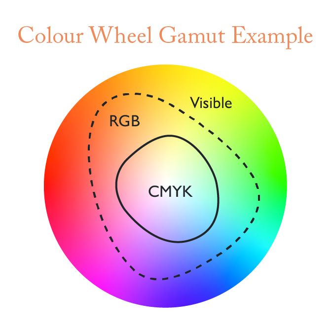
The first thing to understand is that the way colour is reproduced digitally and physically is fundamentally different. Different colour systems produce different percentages of the full spectrum of colour perceivable by the human eye

Colour Wheel Gamut Example

RGB / Hex – on screen

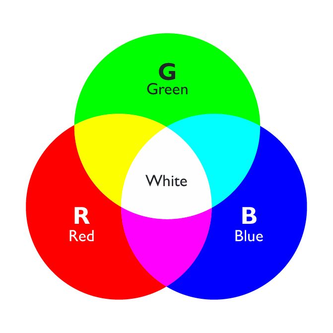
Screens build colour by adding light. Red, green and blue combine at intensities from 0 to 255; full intensity across all three gives you white. This additive model is why screens can produce such vivid, luminous colour – around 16.7 million possible combinations. Hex numbers (which start with a hash symbol e.g. #123456) are a version of RGB colour used in website design.

RGB.jpg

CMYK – in print

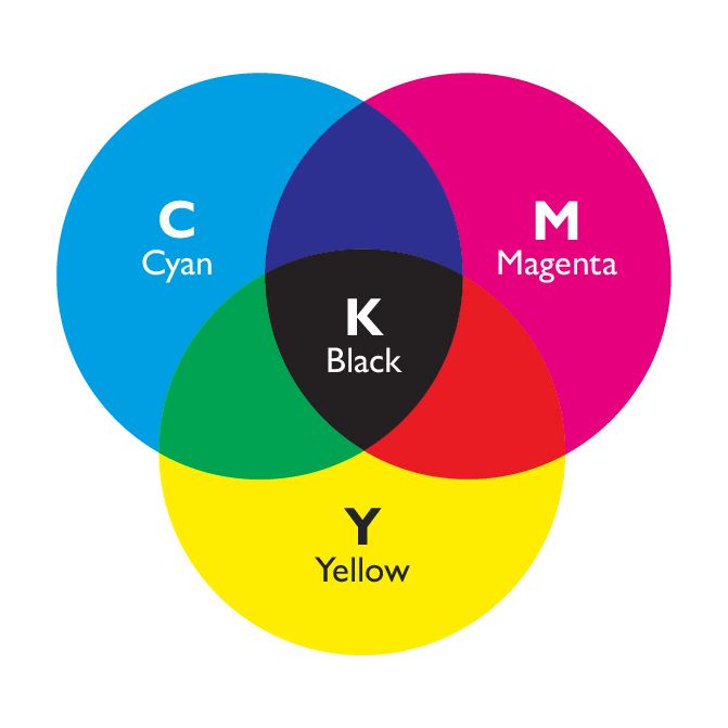
Print works the opposite way. It starts from white (the substrate) and subtracts light by applying ink – cyan, magenta, yellow and black, in varying percentages. This subtractive process is limited to roughly 16,000 colours – a fraction of what RGB can do, which is why print often feels different to what you see on screen.

CMYK.jpg

Pantone Matching System – the reference point

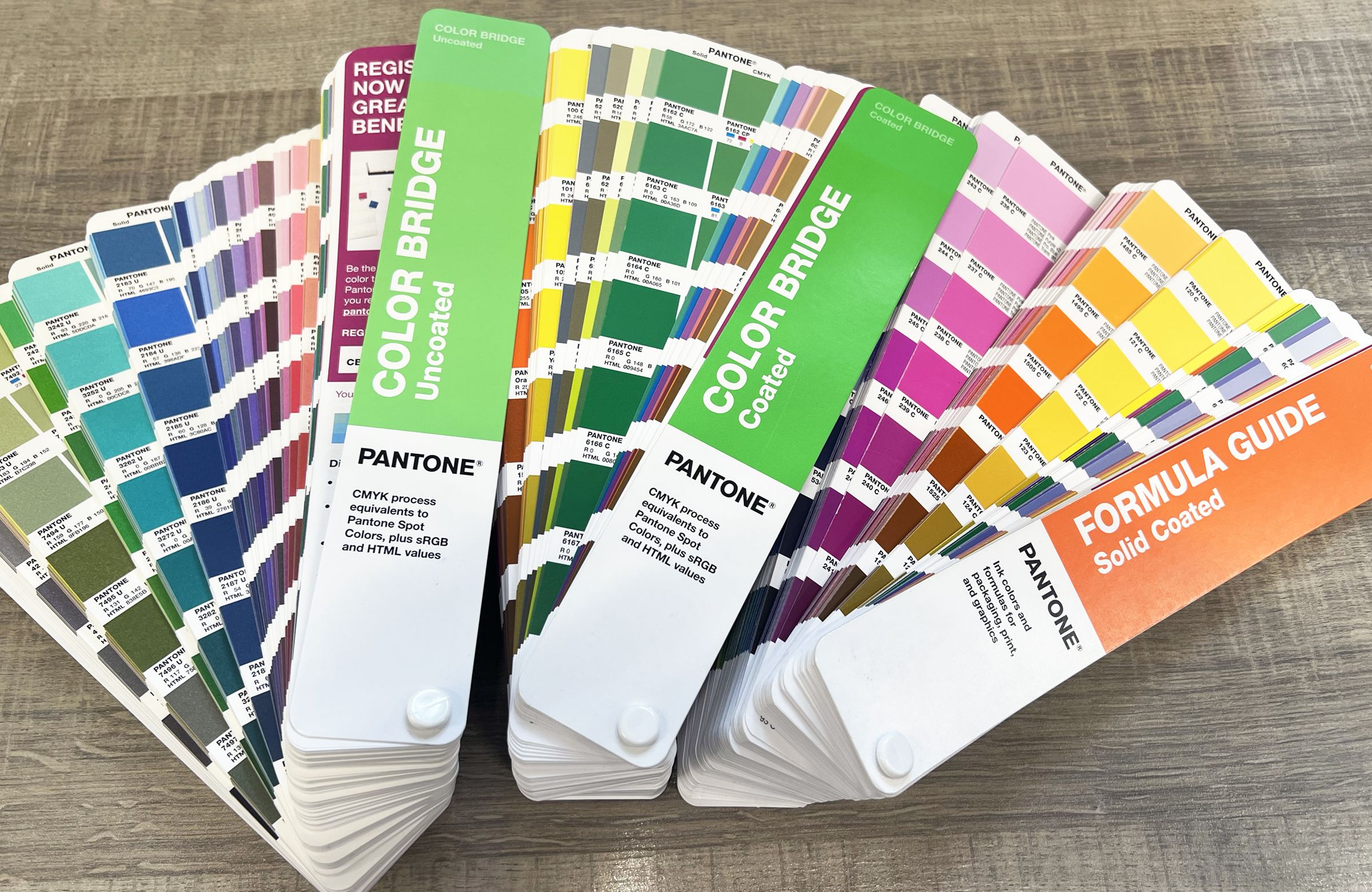
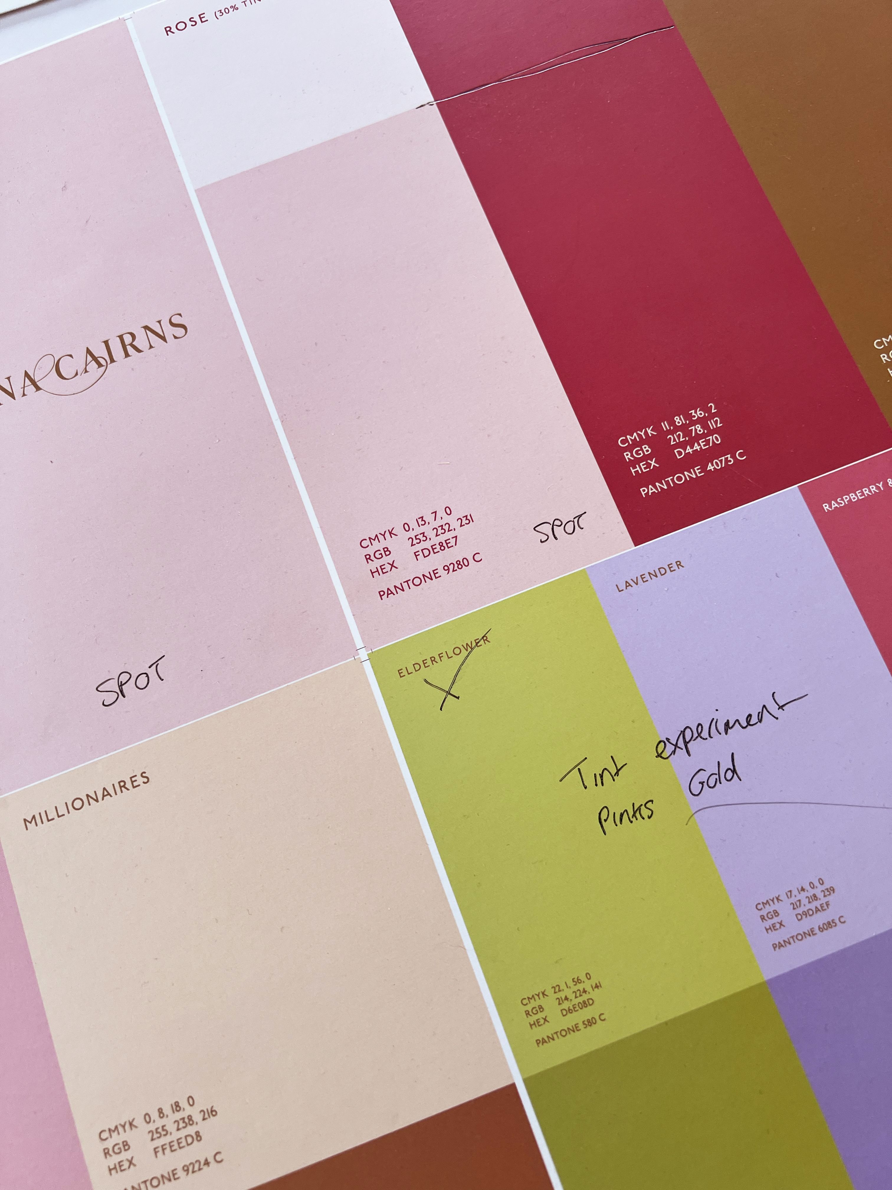
Pantone exists outside of both RGB and CMYK. It is a standardised matching system, where each colour has a unique reference number and a corresponding physical swatch, a bit like paint swatches. This makes it extremely useful as a north star for a brand colour, because it gives designers, printers, and clients a shared point of reference that doesn't rely on a screen or a print process to define it. You look at the swatch, and that is the colour – no interpretation required. In graphics and print there are currently 2,390 spot colors to choose from. 

The catch is that Pantones don’t always directly translate into RGB or CMYK, meaning defining brand colours is as much of a science as it is an art. Our job is to close that gap as tightly as the real world allows.

Colour-matching-Pantone-books.jpg

Pantone Colour Library Swatch Books

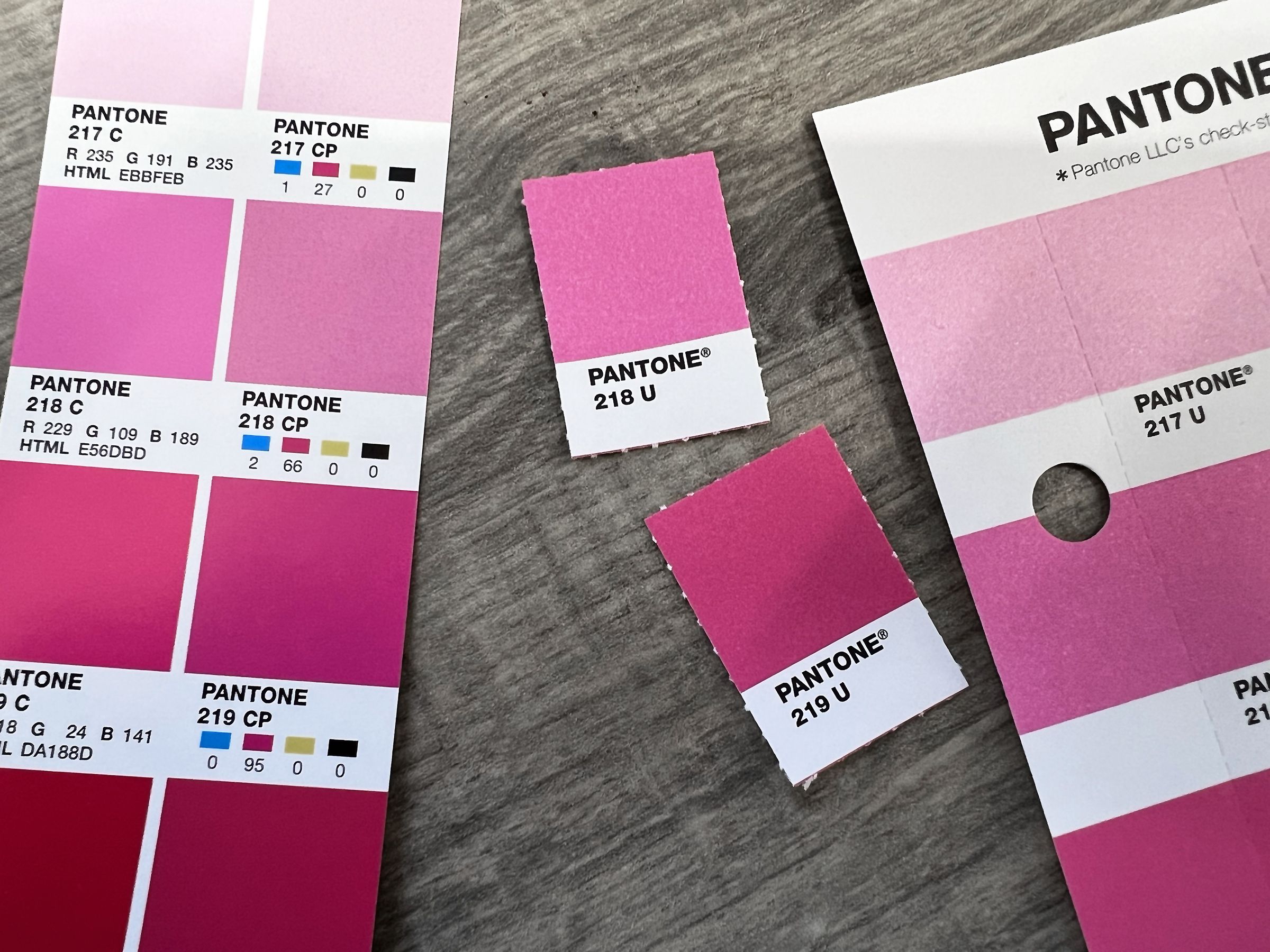
Pantone-matching-colour-challenges.jpg

Pantone Colour Bridge books display the nearest corresponding CMYK, RGB/Hex color values for brand colour matching. The closeness of the match varies depending on the colour with the more vibrant colours especially tricky to accurately translate to CMYK.

How we manage brand colour 

At Optima, most brands begin life on a screen in the design software we use to create brand identities. It’s where ideas move quickly and where colour becomes one of the defining parts of a brand story.

The reality is that a colour which feels bold and vibrant on a screen may behave completely differently in the physical world. A striking neon green on a website will inevitably reproduce duller on a printed brochure. A rich, premium black may lose depth. The same Pantone colour reference can shift dramatically based on whether it is printed on a coated or uncoated paper. 

Good branding is not just about looking great in an ideal scenario. It’s about performing consistently and confidently in the real world. Ultimately, that’s part of our role as designers: not just creating brands that look exciting digitally, but ensuring they translate meaningfully wherever they appear.

That’s why from the earliest stages of a project, we consider how a brand will live across both digital and physical spaces, from websites and presentations through to stationery, packaging, signage, literature and large-scale print applications. This means specifying Pantones from the outset, showing CMYK equivalents early, and physically comparing substrates and finishes with clients before signing off brand visuals.

The challenges of colour in our studio

These projects highlight how colour behaves differently in print, and why early testing and refinement are essential:

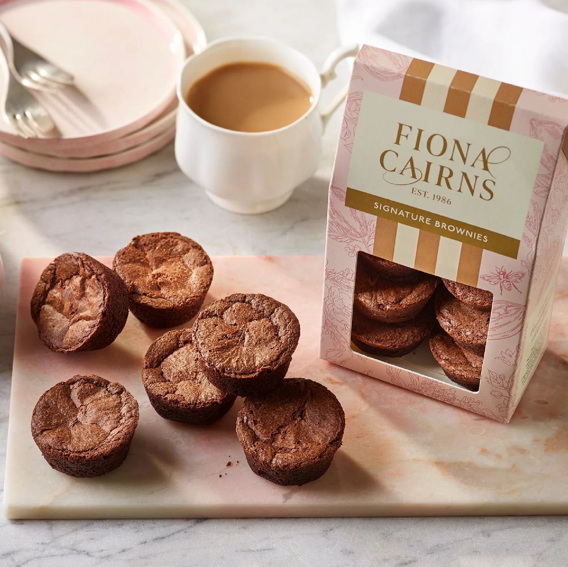
Fiona Cairns

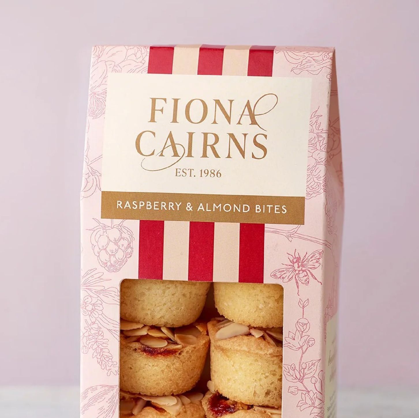
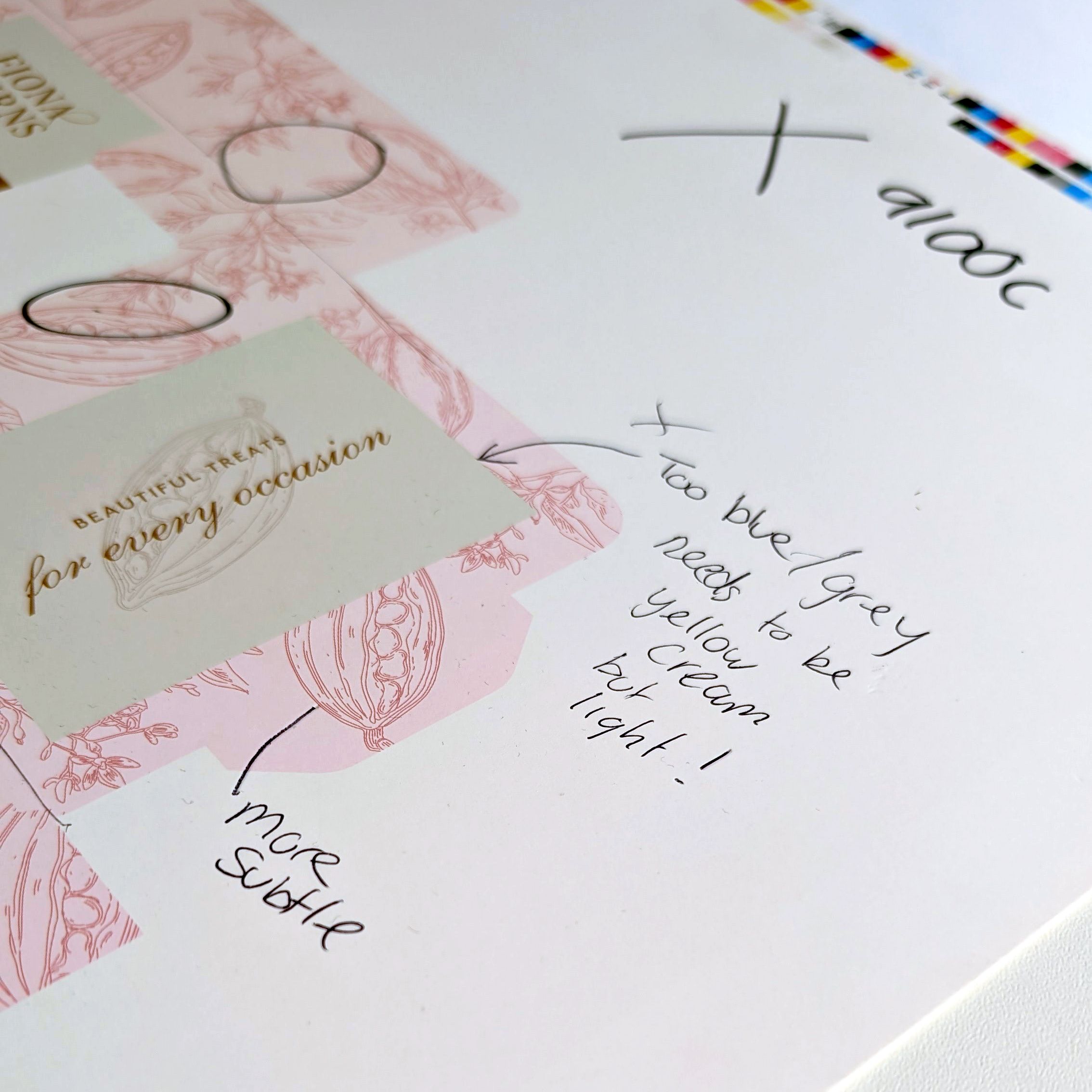
When tasked with creating the packaging for Fiona Cairns, we wanted the visuals to mirror the delicacy of their gentle, intricate and refined cakes and biscuits. We even Pantone matched packaging to the icing colours.

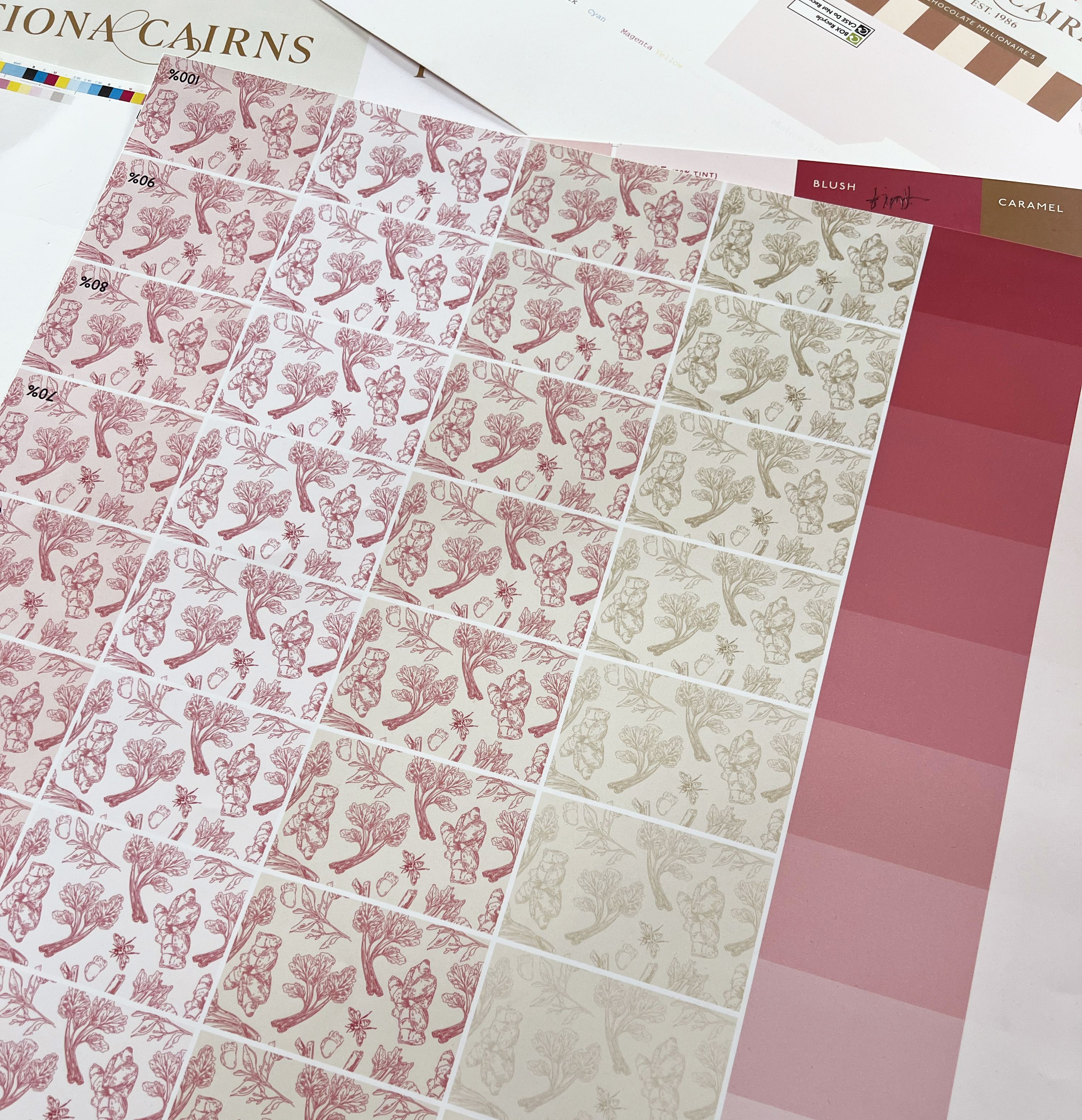
We developed soft pastel packaging with fine‑line botanical illustrations. Digitally, the combination looked elegant and expressive. But once we moved into the physical world, the realities of print became clear. Pastel colours require very light ink coverage, which can make exact matching more complex, and fine‑line detailing increases the risk of crisp patterns losing definition when printed.

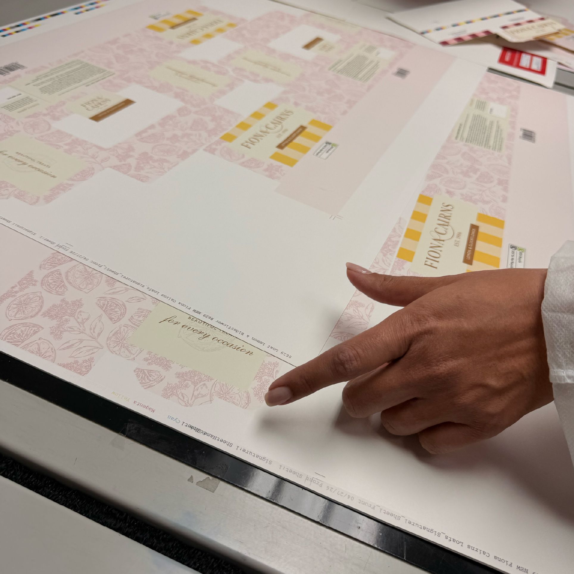
To ensure the packaging retained its delicacy, we refined the colour values, strengthened key linework, and tested multiple print samples to ensure the packaging kept its softness without sacrificing clarity. The result remained gentle, detailed and unmistakably Fiona Cairns.

Fiona Cairns Packaging Design by Optima Design, Lincoln

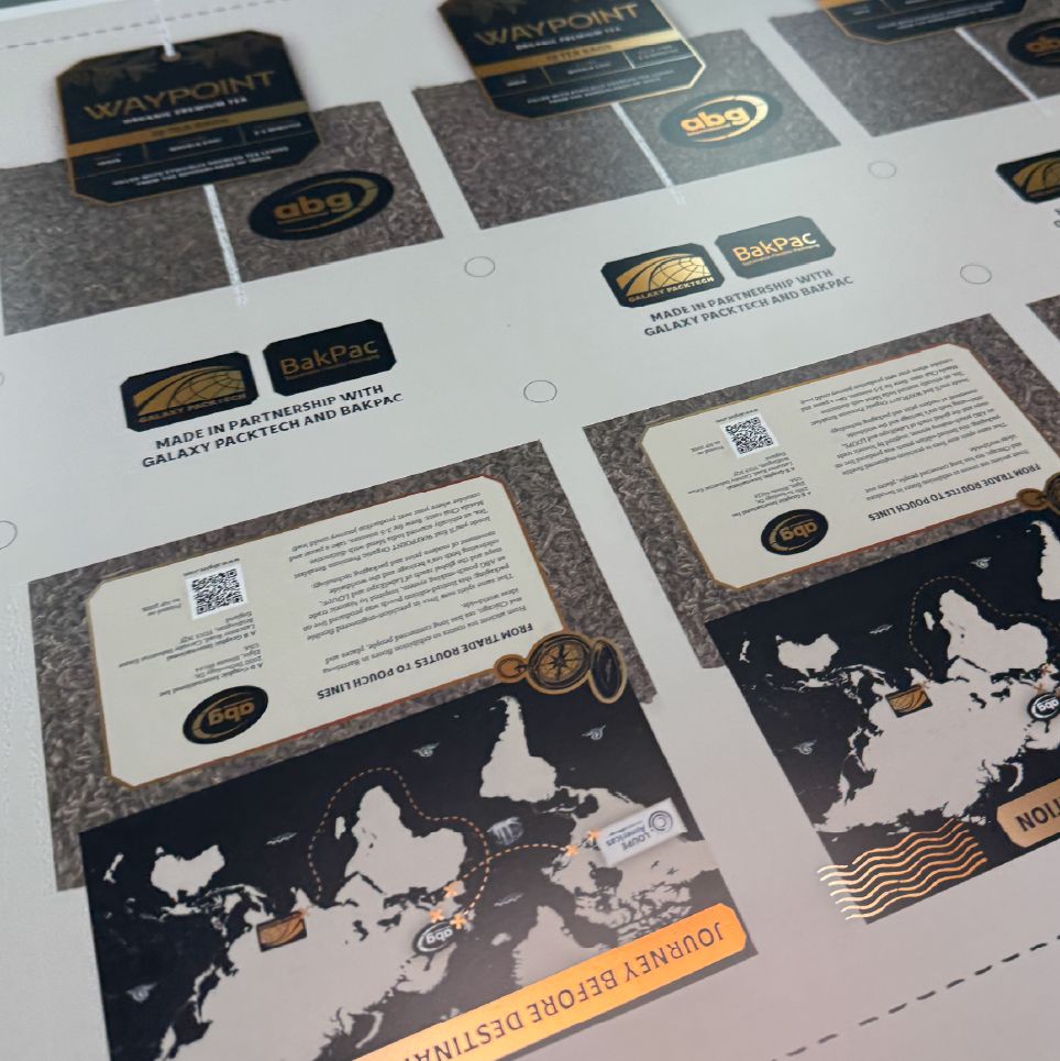
ABG

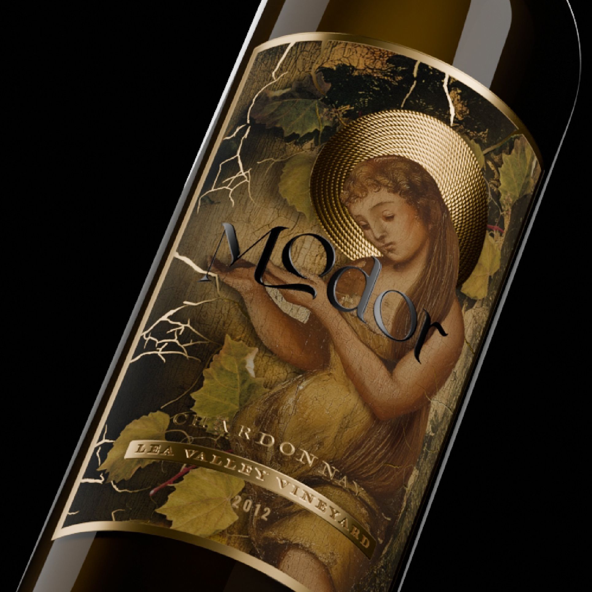
Working with ABG, we developed a suite of premium labels designed to showcase their advanced print capabilities. Digitally, the visuals looked striking, but as with any premium print process, colour behaves differently once specialist finishes enter the equation.

Colours that appear perfectly balanced on screen can shift when interacting with specialist substrates, foils or varnishes. Even small variations in ink density or finish can change how a colour reads, especially with metallics or high‑gloss surfaces.

By collaborating closely with ABG’s print team, we achieved colours that were precise, consistent and reflective of their technical expertise. The final labels delivered premium colour, exceptional clarity and a physical product that matched (and even exceeded!) the digital vision.

ABG_-_4.jpg
ABG-Labels-Montage-3.png
ABG_-_2.jpg
ABG_-_1.jpg

Born Tasty

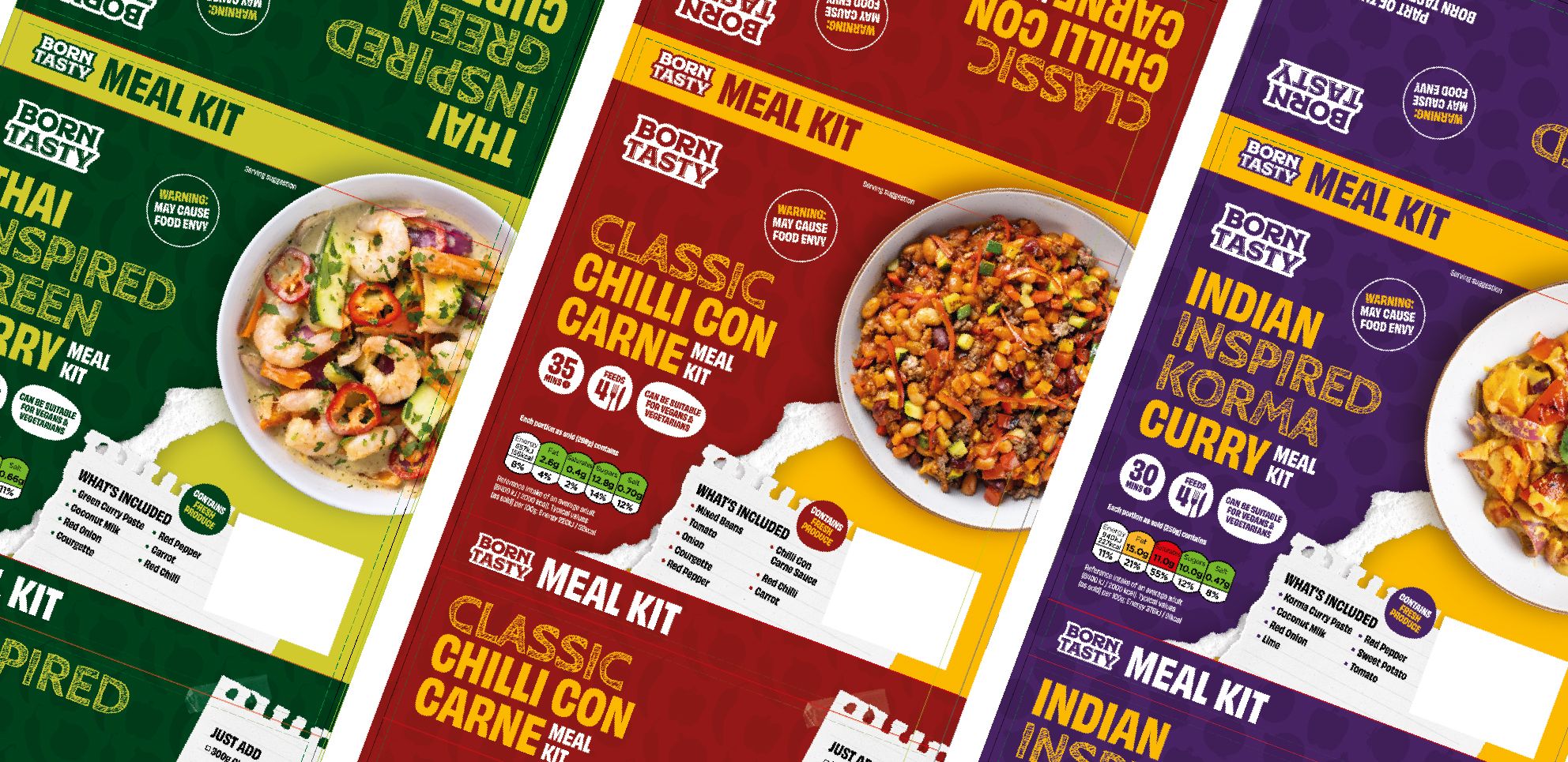
Designing packaging for Born Tasty, a bold and energetic food brand, meant creating visuals that were instantly recognisable on shelf. Their identity relies on vivid colour and confident contrast, but during development it became clear that some products were reading too similarly in print, making it harder for customers to distinguish between flavours.

On screen, the palettes looked bright and expressive. Once printed, however, certain colours flattened, contrast dropped, and the similarities between products became even more pronounced, reducing both clarity and impact.

To resolve this, we refined the palette, strengthened contrast levels and tested multiple CMYK builds to ensure each product had its own distinct presence. The final packaging regained its bright, confident personality, with clearer differentiation between products, while performing reliably across every printed format.

A Spotlight Example: Wheeldon Developments

While Fiona Cairns, ABG and Born Tasty each dealt with subtle shifts in tone and contrast, Wheeldon presented a different challenge entirely: neon.
 
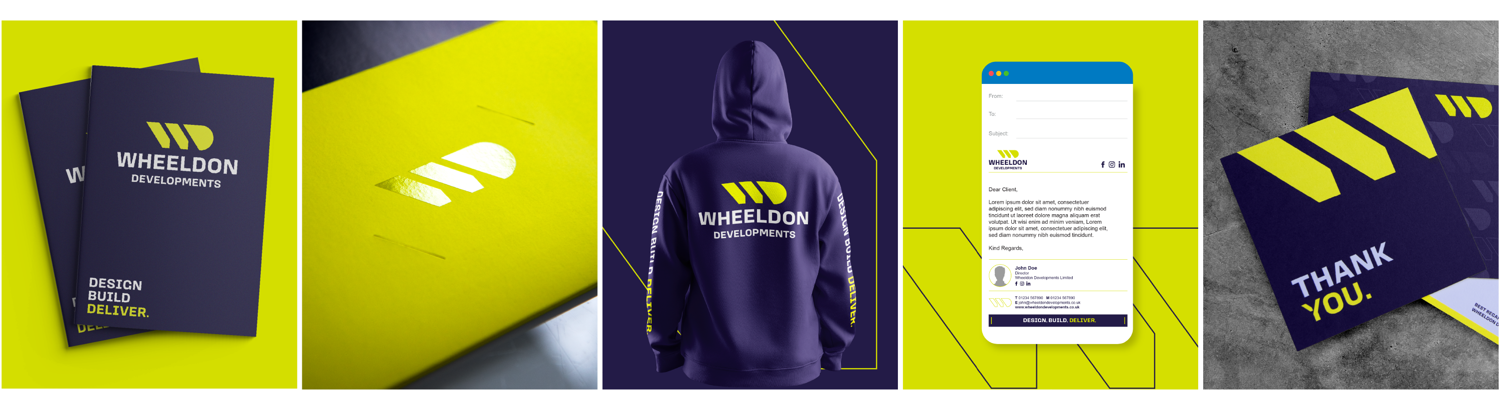
The director of Wheeldon Developments approached us to evolve their brand, with colour as a key focus. Over a period of visualising and consulting, we agreed on Pantone 809C, a neon green that appears bright, optimistic and exciting on screen.

Neon shades sit in a part of the colour spectrum that screens handle comfortably, but print struggles to reach. Their vibrancy comes from its intensity, and that intensity is difficult to replicate through the subtractive CMYK process of layering cyan, magenta, yellow and black inks onto paper. Specialist neon inks do exist, but they are less common and more expensive to produce, which is reflected in their cost.

Without specialist inks, the CMYK equivalent will always be softer and less punchy than the Pantone swatch or digital representation. From the outset, we made sure to communicate this clearly. Pantone 809c could be used where specialist neon inks and suitable substrates were available; everywhere else, we would need to create a working CMYK equivalent chosen by eye, using physical Pantone books and agreed upon by the Optima studio team.

Wheeldon-montage-3.png

But colour impact isn’t limited to ink alone. Many of the Wheeldon materials use foil, spot UV and other finishes that catch attention and elevate the brand even when neon ink isn’t used, a reminder that print offers multiple ways to achieve standout.

This project reinforces one of the core principles of colour management: understanding how colour behaves in the real world, communicating limitations early, and designing with both digital and physical outcomes in mind.

Get. Samples. Every. Time!

If there’s one non-negotiable lesson from handling complex print projects that I would recommend to anyone working in the print space, it is this:

To not get a sample is to accept uncertainty. A sample will always be the most important item printed, it is your quality reassurance before printing a full run. A cupboard of x5,000 super brilliant bespoke items is worth nothing if they are not fit for purpose, and they will still cost you.

Sometimes a full printed sample can be expensive, depending on the specification. But there is always a way to get something comparable, such as a previous project, a similar stock, a partial test, or a close match. Any level of confidence is better than a best guess

Test_Print_Samples.jpg

Working with Print Partners

Complex colour requirements aren't something you walk into knowing every answer. When a project pushes into new territory, specialist inks, unusual substrates, unfamiliar processes, the right approach is open discussion.

We’re fortunate to have long-standing print partners we trust to experiment and problem-solve with us on complex projects. Good print partners advise, flag issues and run test prints to make sure everything is right before a full run. That collaborative relationship is, frankly, one of the most valuable things you can have when you're working at the edge of what is possible in print.

Julian@printers.jpg
modern-printing-press-in-operation-with-paper-2026-03-25-02-19-02-utc.jpg

In Conclusion

Experimentation is a core part of creativity and creative problem solving. Advising and delivering the best possible outcome is essential to our work, and understanding how colour behaves is central to that.

Whether it’s pastels, premium finishes or bold FMCG palettes, every project reinforces the same truth: colour must be designed for the real world.

We design on a screen, but we make sure the benefit is realised wherever a brand appears.

And in case you missed it earlier…

GET. SAMPLES. EVERY. TIME.

Need help achieving better colour consistency for your brand? Get in touch.